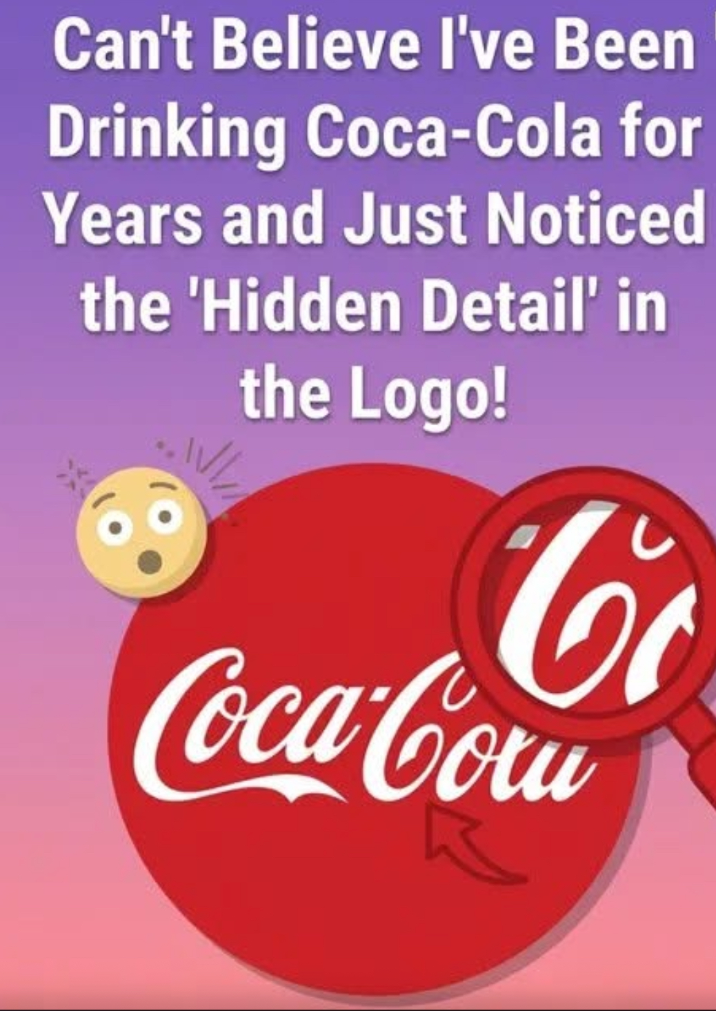
Sometimes it takes only a second for the way we see something familiar to change completely. Someone points out a small detail, and suddenly the design looks different forever. Many people have experienced this with the famous Coca-Colalogo. When you look closely at the second “C” in the word “Cola,” the curved shape can appear almost like a gentle smile. Once that idea is noticed, it becomes hard to ignore. What once seemed like a simple flourish of lettering begins to feel warmer and more welcoming, almost as if the bottle itself carries a friendly expression. It raises an interesting question: was this subtle “smile” intentionally designed, or is it simply the human mind finding meaning where none was planned?
The iconic Coca-Cola script dates back to the late 19th century. In the 1880s, bookkeeper Frank Mason Robinson created the brand’s flowing lettering using the elegant Spencerian writing style that was popular at the time. The goal was to give the new drink a distinctive and refined appearance that would stand out in advertisements and signage. Historical records show that Robinson focused mainly on balance, readability, and visual charm when designing the logo. There are no surviving notes suggesting hidden symbolism or emotional cues in the letters themselves. The sweeping curves and loops were simply part of the decorative handwriting style of the era.
Yet over the decades, the perception of the logo has evolved. As the Coca-Cola brand grew, its imagery became closely associated with positive experiences—family gatherings, celebrations, holidays, and moments of relaxation. Advertising campaigns often emphasized happiness and togetherness, gradually shaping how people felt when they saw the brand. As a result, viewers began to interpret the flowing shapes of the logo differently. That curved “C” in “Cola” started to feel less like decorative typography and more like a friendly gesture. The logo itself never changed, but the emotional connection people formed with it did.